This has been a very good year for charts and tables. Indeed, my 2009 GlobeAsiacolumns from January to November contain 20 charts and 11 tables. In what follows, I update some of my favorites.
Governments have been blowing asset bubbles for a long time. The bubbles eventually burst, inflicting untold damage on those who aren’t fast afoot. Just consider John Law (1671 – 1729) and the fate of his Mississippi Company (see chart).

John Law’s link to today’s economic and financial turmoil is via a Law-Keynes linkage. Like John Maynard Keynes (1883 – 1946), Law thought the economy could be stimulated and that growth rates could be permanently elevated through active monetary, fiscal and exchange-rate policies.
In short, both economists supported the idea of an active, interventionist government. Today, this fashion is back in style. When the bubbles burst and panic set in, the demand for money soared and the money multiplier collapsed in mid-September 2008 (see chart).

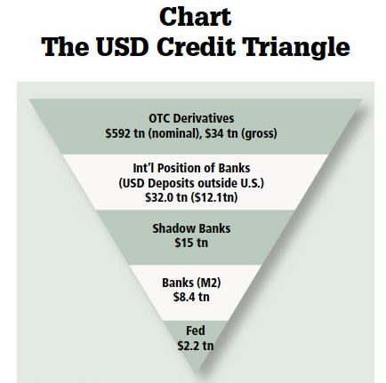
To stabilize the delicately balanced credit triangle, which depicts the modern fractional-reserve banking system (see chart), the Federal Reserve more than doubled the size of its balance sheet in three short months.

The Fed’s balance sheet expansion, among other things, has produced a monetary time bomb. If not defused, the bomb will go off in a burst of inflation.
Participants in the commodity markets sensed this danger almost immediately. Indeed, the volatile Baltic Dry Index — which is a freight-rate benchmark for shipping dry bulk commodities, like building materials, grains, coal and iron ore — bottomed out in December 2008 (see chart), just as the Fed’s balance sheet was setting new records for size.

Not surprisingly, commodity prices have marched higher since December 2008 (see chart), with the all-important price of gold making new highs as this column goes to press.

The world’s central bankers and finance ministers call for more intervention. Some pundits go a step further and claim that the crisis in the U.S. was caused by freemarket reforms introduced during the Reagan years (1981 — 1988).
This is truly a bizarre idea. The misery index signals that economic improvement (lower inflation, unemployment and interest rates, coupled with above-trend GDP growth) was more pronounced during the Reagan years than in any other administration since Truman’s.

The misery index tells an important story. We need less interventionism, not more.
Author Steve H. Hanke

0 responses on "2009 in Charts"